Internal Reference — habchy.com
Design
Language.
This document is the single source of truth for
every visual, motion, and code decision on habchy.com. Read it
before you change anything. Every token, rule, and number here is
exact — pulled directly from style.css,
parallax.js, and 404.js. The design
concept is warm archaeological luxury: Baalbek
ruins, cream linen suit, gilded afternoon light. Every decision —
color, type, motion — traces back to that one image. If it doesn't
feel like it belongs in that image, it doesn't belong on this site.
Nothing is added unless it earns its place. Empty space is not waste — it is the breathing room that makes what remains feel precious. When in doubt, remove it.
Parallax, glass, and shadow create dimensionality. Never orbs, particles, gradients blobs, or decorative geometry. Depth comes from light and material, not busyness.
Cormorant Garamond carries monumental editorial weight. Jost is the quiet structural grid underneath. The H monogram is silent — always intentional, never decorative.
Gold over blue. Parchment over stark white. The palette references ancient stone and candlelight — human and warm even in dark mode. Never icy, never techy-blue, never flat grey.
The mobile experience is designed on its own terms. The nav disappears; a glass panel, a mobile H mark, and adapted type scale replace it. Nothing is just "shrunk from desktop."
Instant feels luxurious. Slow feels cheap. Hero images are preloaded, analytics deferred 2s, fonts non-blocking, all animations on GPU-composited properties only.
Dark Mode — @media (prefers-color-scheme: dark)
Light Mode — :root (default)
style.css :root
rgba(14, 13, 11, 0.55) — card background, always
semi-transparent
rgba(245, 241, 232, 0.52)
rgba(242, 239, 232, 0.08) — barely visible white
stroke
rgba(26, 21, 16, 0.09) — barely visible dark
stroke
rgba(255, 255, 255, 0.04) — top-edge inner
glow
rgba(255, 255, 255, 0.55)
0 16px 64px rgba(0,0,0,0.55), 0 2px 8px
                    rgba(0,0,0,0.3)
0 16px 64px rgba(26,21,16,0.1), 0 2px 8px
                    rgba(26,21,16,0.05)
rgba(14, 13, 11, 0.85) — more opaque than cards;
nav needs to be legible
rgba(245, 241, 232, 0.80)
#C9A84C dark / #1A1510 light
0.065 dark / 0.045 light — always
extremely subtle
rgba(201,168,76, 0.10–0.12) — hover backgrounds
on pills, buttons
var(--accent),
var(--fg), etc. for every color value. The theme
switch is entirely automatic through CSS custom properties.
#C9A84C, #0E0D0B, or any
hex directly in HTML or new CSS rules. If you hardcode, the
light/dark switch breaks.
Habchy.
Explorer.
.hero-name) is always #F2EFE8 in dark
mode and #1A1510 in light mode — it is NOT
var(--fg). The hero is a photo background, so the text
color must be fixed for contrast regardless of the glass vignette.
Don't change this to var(--fg) — it will break light
mode contrast.
media="print" onload="this.media='all'" —
non-blocking. Falls back via <noscript>.
Never use render-blocking link.
assets/fonts/:
fa-brands-400.woff2,
fa-solid-900.woff2. Used for social icons
only.
.woff2 files are preloaded via
<link rel="preload"> with
crossorigin on index.html.
var(--glass-bg) — semi-transparent, adapts per
mode. Never opaque.
1px solid var(--glass-border) — hairline, barely
visible.
16px for cards. 100px for nav pill.
12px for lang items. 100px for skill
pills. 2px for buttons (intentionally sharp —
contrast to the rounded surfaces).
blur(32px) saturate(1.4). Always include
-webkit-backdrop-filter for Safari. Nav uses
blur(32px) saturate(1.8).
var(--glass-shadow), inset 0 1px 0 var(--glass-hi). The inset creates a top-edge highlight like
light catching the glass rim.
clamp(1.75rem, 4vw, 2.75rem) default. Bio card:
clamp(2rem, 5vw, 3.5rem).
translateY(-2px) lift +
border-color: rgba(201,168,76,0.18) + faint outer
gold ring 0 0 0 1px rgba(201,168,76,0.08).
Duration: 0.32s.
var(--nav-bg) — more opaque than cards (0.80
light / 0.85 dark) so text is always legible.
1px solid var(--nav-border)
0 4px 24px rgba(0,0,0,0.12), 0 1px 4px rgba(0,0,0,0.08),
                    inset 0 1px 0 var(--glass-hi)
blur(32px) saturate(1.8) — stronger saturation
so the nav pops against any background.
50px fixed. Padding: 0 2.5rem.
min-width: 320px.
Born in Beirut, raised in Boston. Building fast, modern experiences from the ground up.
Hover the cards to see lift + gold border glow
backdrop-filter requires the element to have a non-100%
opaque background. If you set
background: transparent the blur disappears on Safari.
Always use a semi-transparent background with backdrop-filter.
6px × 6px — thin, unobtrusive. Webkit only
(::-webkit-scrollbar). Firefox uses
scrollbar-width: thin.
background: transparent — the track is
invisible. Only the thumb is visible.
rgba(201, 168, 76, 0.35) resting →
rgba(221, 185, 90, 0.65) hover →
rgba(232, 201, 106, 0.8) active.
border-radius: 100px.
rgba(184, 146, 46, 0.30) resting →
rgba(184, 146, 46, 0.55) hover →
rgba(184, 146, 46, 0.75) active. Slightly darker
base to stay visible on parchment.
scrollbar-width: thin; scrollbar-color: rgba(201, 168, 76,
                    0.35) transparent
on *. Light mode override:
rgba(184, 146, 46, 0.3) transparent.
::-webkit-scrollbar-corner { background: transparent
                    }
— hides the dead corner where horizontal and vertical
scrollbars meet.
Scroll to see the gold thumb
The scrollbar thumb is gold at 35% opacity at rest, brightening to 65% on hover and 80% on active. The track is fully transparent — only the thumb is visible.
In light mode the base shifts to
rgba(184,146,46,0.30) — slightly darker to stay
visible against the warm parchment background.
Firefox uses scrollbar-width: thin and
scrollbar-color — the same gold values, no custom
thumb shape available.
::selection
rgba(201, 168, 76, 0.22) — faint
gold wash. color: #E8C96A — bright gold text.
text-shadow: dual gold glow (0 0 12px rgba(232,201,106,0.55), 0 0 28px
rgba(201,168,76,0.2)). Feels like light catching gilded lettering.
rgba(26, 21, 16, 0.85) — deep umber
wash. color: #E8C96A — same bright gold.
text-shadow: slightly softer glow (0 0 10px rgba(232,201,106,0.5), 0 0 24px
rgba(201,168,76,0.18)). Like ink on parchment catching candlelight.
text-shadow inside
::selection is not supported in Firefox — it is
silently ignored. The color + background still apply correctly in
all browsers.
Hover to preview
Tooltips are driven entirely by CSS — no JavaScript. The label
text comes from a data-tooltip attribute on each
<a> via
content: attr(data-tooltip). The tooltip is a
::before pseudo-element; there is no arrow (::after
is display: none).
data-tooltip="Label" attribute on
.social-icons a. The <a> must
have position: relative as the anchor.
bottom: calc(100% + 8px); left: 50%.
Horizontally centered via
transform: translateX(-50%) translateY(4px)
(resting) → translateY(0) on hover.
var(--glass-bg),
backdrop-filter: blur(24px),
1px solid var(--glass-border),
var(--glass-shadow) + inner highlight + faint
gold ring 0 0 0 1px rgba(201,168,76,0.06).
var(--accent-bright). Padding:
0.35rem 0.75rem 0.35rem calc(0.75rem + 0.22em)
— extra left padding compensates for letter-spacing trailing
gap to keep text optically centered.
0.2s var(--ease) /
0.2s var(--ease-out).
pointer-events: none always — never blocks
clicks.
@media (hover: none) sets both pseudo-elements
to display: none. Tooltips never appear on mobile
— no hover state exists.
*
Firefox rule already covers it. For Webkit, the
::-webkit-scrollbar rules on :root
cover everything.
::after triangle) — the
current design intentionally omits it for a cleaner float. Don't
use JS tooltip libraries; the pure-CSS approach is zero-overhead
and already handles all edge cases.
clamp() for any
spacing that should adapt between mobile and desktop. Example:
clamp(1.75rem, 4vw, 2.75rem). The middle value is the
ideal at ~1200px. Never use a fixed px value for structural layout
padding.
Color transitions, opacity fades, border-color changes, link hover states. Duration: 0.22–0.35s. Hover this card to feel it.
Load-in animations, scroll reveals, entrance keyframes. Explosive deceleration — feels cinematic. Duration: 0.8–2s. Hover this card to feel it.
Micro-interactions: nav dot reveal, logo hover scale, pill hover lift, back-link gap expand. Slight overshoot = alive. Duration: 0.22–0.28s. Hover this card to feel it.
| Name | Element | Duration / Delay | What it does |
|---|---|---|---|
| bgReveal | .hero-bg-wrap | 2s / delay 0.1s | opacity 0→1, scale 1.05→1. Panorama swells into view. Uses --ease-out. |
| fgReveal | .hero-fg-wrap (desktop) | 1.6s / delay 0.8s | opacity 0→1, translateY(32px→0). Figure rises up after bg has settled. |
| fgRevealMobile | .hero-fg-wrap (mobile) | 1.6s / delay 0.8s | translateX(-50%) translateY(32px→0). Preserves centering transform during load-in. Critical — see parallax section. |
| panelReveal | .hero-panel and each child | 1.4s / staggered 0.1s steps | opacity + translateY(22px→0). Eyebrow 0.2s, name 0.28s, tagline 0.36s, rule 0.42s, buttons 0.48s, icons 0.54s. |
| navFade | .site-nav | 1.6s / delay 0.3s | Opacity only — 0→1. No movement. Nav arrives like a watermark, not a UI element. |
| logoMarkFade | .hero-mark (mobile) | 2.2s / delay 1.2s | opacity 0→0.12, translateY(calc(-50%+18px)→-50%). Defined once but ends at opacity 0.12, not 1. (Mobile hero only.) |
| aboutMarkFade | .about-header-mark (mobile) | 2s / delay 0.6s | opacity 0→0.05, translateY(10px→0). Arrives quietly after heading text. |
| nfBgReveal | .nf-marquee-bg | 1.8s / delay 0.2s | opacity 0→1 on 404 marquee background. |
| nfContentReveal | .not-found-content | 1s / delay 0.3s | opacity + translateY(20px→0). 404 page text arrives. |
| nfMarqueeLeft / Right | .nf-marquee-track | JS-generated, 28–36s, linear, infinite | Injected by 404.js. translateX(0 ↔ -totalShift). totalShift = (MARK_SIZE+GAP) × MARKS_PER_ROW = 2100px. |
| Scroll reveal | .reveal, .reveal-stagger | 0.8s (elements), 0.55s (stagger children) | IntersectionObserver triggers .visible class. translateY(32px→0) + opacity. Cards stagger at 0/0.12/0.24s. Pill children stagger at 0.04s increments up to child 12. |
| scrollDrop | .scroll-line | 2.4s / delay 1.8s, infinite |
Scroll hint line on index.html — scaleY 0→1 (top origin)
then 0→1 (bottom origin) with opacity fade. Currently
display: none — exists but is intentionally
hidden. Do not remove the CSS or HTML.
|
| hintFade | .hero-scroll-hint | — |
Fade-in for the scroll hint container. Currently unused
(display: none on the element). Paired with
scrollDrop.
|
will-change is set
to auto. The JS parallax.js checks
window.matchMedia('(prefers-reduced-motion: reduce)')
before running. The 404.js checks it too.
Never add an animation without adding its reduced-motion override
in the @media (prefers-reduced-motion: reduce) block
at the bottom of style.css.
.reveal — card 1 · delay 0s
Fades up from translateY(32px). Duration:
0.8s var(--ease-out).
.reveal — card 2 · delay 0.12s
Same animation, staggered. The 3 about-page cards arrive at 0s, 0.12s, 0.24s.
.reveal-stagger — card 3 · delay 0.24s · children cascade at 0.04s
JavaScript TypeScript React Python Node.js CSS
The JS parallax writes style.transform directly on
.hero-bg and .hero-fg every animation
frame via requestAnimationFrame. If we also put a CSS
load-in animation on those same elements using
transform, the JS overwrites it the instant the mouse
moves — the element snaps to its JS position, killing the
animation.
Solution: Two wrapper
divs: .hero-bg-wrap and .hero-fg-wrap.
CSS animations run on the wrappers. JS writes transforms on the
inner img elements. These are always different DOM nodes → no
conflict.
0.022 — background moves 2.2% of cursor offset
from viewport center. Conservative: keeps the Baalbek columns
in frame.
0.058 — foreground figure moves 5.8%. Greater
delta = apparent depth. The ratio matters more than the
absolute values.
0.07 — interpolation factor per frame. Each
frame: current += (target - current) * 0.07.
Lower = more cinematic lag. Don't go above 0.12.
0.55 before writing
— vertical motion is more restrained. The figure stays
grounded.
'ontouchstart' in window check disables parallax
on mobile. The hero still looks correct because the CSS
wrapper positions handle the initial state.
translate3d(calc(-50% + Xpx), calc(-50% + Ypx), 0)The
-50% preserves the CSS centering (top:50%; left:50%; transform:translate(-50%,-50%)). If you write just
translate3d(Xpx, Ypx, 0) the image jumps to the
top-left corner of the scene.
translate3d(Xpx, Ypx, 0) — plain, no percentage
offset.Desktop: .hero-fg-wrap is positioned with
right + bottom. No CSS transform on
the wrapper, so the img has a clean slate.Mobile: .hero-fg-wrap carries
left:50%; transform:translateX(-50%) for
centering. The img fills the wrapper 100%. JS writes plain
translate3d on the img — no -50% needed because the WRAPPER is
already centering it. If you accidentally add -50% to the JS
transform on mobile it will double-apply the offset and shift
the figure off to the left.
left: 50%; top: 4vh; width: 88vw; max-width: 88vw; height:
                    115vh; transform: translateX(-50%)
fgRevealMobile — from
translateX(-50%) translateY(32px) to
translateX(-50%) translateY(0). Must include the
-50% in both keyframe states or the element snaps to the wrong
X position when the animation ends.
@media (prefers-reduced-motion: reduce) block
resets .hero-fg-wrap { transform: none } for
desktop, but a nested
@media (max-width: 700px) inside it restores
transform: translateX(-50%). This is required —
without it the figure is off-center when animations are
disabled.
0.32 — watermark translates upward at 32% of
scroll speed. Feels like it's on a deeper plane.
translateY(-(scrollY * 0.32)px) on
.about-watermark. Passive scroll listener,
rAF-debounced, only fires when scrollY changes.
0.08, rootMargin:
"0px 0px -60px 0px" (elements trigger 60px before
bottom of viewport). Adds .visible class then
unobserves.
grid-template-columns: 1fr auto 1fr. Left cell =
About link (right-aligned). Center cell = Logo. Right cell =
Résumé link (left-aligned).
position: fixed; top: 1.5rem; left: 50%; transform:
                    translateX(-50%)
. Always centered, always floating.
200 — above parallax layers (0), hero panel
(10), watermark (0).
height: 50px; min-width: 320px; white-space: nowrap
display: none at ≤700px. The hero has its own
CTA buttons and the panel is full-width at the bottom.
The vertical hairline rules on either side of the logo are
not pseudo-elements of .nav-logo.
They are pseudo-elements of
.nav-link-left::after (right edge) and
.nav-link-right::before (left edge). This is
intentional: if they were on the logo, they would participate in
transform: scale(1.08) on logo hover and wiggle. By
living on the sibling cells, they are completely independent of
hover states.
width: 1px; height: 14px. Centered vertically
with top: 50%; transform: translateY(-50%).
linear-gradient(to bottom, transparent, var(--accent),
                    transparent)
— fades to invisible at both ends. opacity: 0.4.
Two <img> elements are always in the DOM. One
shows, one hides. The selector is scoped to
.nav-logo for full specificity — without this scope,
the rules can be overridden by less-specific selectors elsewhere.
On index.html, .nav-logo links to
design-language (this page). On all other pages, it
links to / (home). Since the nav is hidden on mobile,
this is effectively a desktop-only Easter egg link.
Hover links for dot indicator · Résumé shown with active state · Logo hover scales
The H letterform is a single <path> element.
The viewBox is always "0 0 3971.7893 4497.9053". The
<g> group always has
transform="translate(-2132.5701,-1799.2671)". The
path d attribute begins
m 2187.2791,6296.0601.... This is the same path used
everywhere — nav logo SVGs, inline watermarks, 404 marquee. Never
modify the path data.
habchy.svg (dark ink) in light mode /
habchy-white.svg in dark mode. External
<img> elements,
height: 28px; width: auto. Hover:
scale(1.08) spring, opacity: 0.8.
.about-watermark. Fixed to
right side of viewport: right: -6vw,
width: clamp(240px, 48vmin, 460px), vertically
centered. Opacity via
var(--watermark-opacity) (0.045–0.065). Gold in
dark mode, umber in light mode via
var(--watermark-fill). Hidden below 600px.
Smaller on 601–900px.
.about-header-mark. Absolutely
positioned within .about-header:
top: -6vw; right: -10vw; width: 62vw; max-width:
                    280px
. The negative right causes it to bleed half off-screen.
Opacity animates 0→0.05 via
aboutMarkFade (2s delay 0.6s). Fill:
var(--accent-bright).
.hero-panel, class
.hero-mark. display: none on
desktop. Mobile:
position: absolute; top: 44%; right: 4%; transform:
                    translateY(-50%); width: 42vw
. Behind panel text via z-index: -1. Animates
via logoMarkFade to opacity 0.12.
404.js. 5 rows of 28 marks (14
original + 14 duplicate for seamless loop). Each mark:
110px × 110px, gap 40px. Odd rows
scroll left, even rows scroll right. Duration: 28–36s per row,
staggered by −3.5s × row index. Fill:
var(--accent), opacity: 0.10 on the
path element.
favicon.svg at root. Inline
<style> inside it: fill
#1A1510 in light mode, #C9A84C in
dark mode via prefers-color-scheme. Fallback:
favicon.png.
aria-hidden="true" focusable="false" on
every decorative SVG instance (watermarks, hero mark, 404 marks).
They are visual decoration — screen readers must skip them.
var(--accent),
var(--accent-bright), var(--fg), or
var(--watermark-fill). Don't add more than one
prominent H mark on the same screen — they should be accents, not
patterns.
The logo is a single custom H letterform — a hand-drawn monogram representing the Habchy name. It exists as external SVG files (for the nav), an inline SVG path (for watermarks and 404), and a theme-adaptive SVG favicon. There are no other variants of the wordmark and no horizontal lockup. The H alone is the brand.
0 0 3971.7893 4497.9053 — always. The path
coordinates are relative to this box.
translate(-2132.5701,-1799.2671) — always on the
wrapping <g>. This offsets the path from
the original Inkscape canvas coordinates.
<path> element — no
groups of sub-paths, no clipping masks. This is why it renders
crisply at any size and is easy to color.
width or height +
viewBox for scaling. Never use
transform: scale() on the SVG element itself — it
breaks positioning in some contexts.
d attribute of
the H path is a handcrafted letterform. Never run it through an SVG
optimizer that simplifies path data — it will subtly alter the
curves. The path data in the HTML, in the two SVG files, and in the
JS config must always be identical.
.hero:
position: relative; height: 100vh; display: grid;
                    grid-template-columns: auto 1fr; overflow: hidden
. Grid places .hero-panel in column 1, rest of
scene fills column 2 (via absolute positioning).
rgba(8,7,5).
rgba(245,241,232) instead: (1) 105deg — 94%→0%
(dense warm wash on left). (2) Bottom-up — 55%→0% at 50%. No
top gradient. Creates warm-white editorial feel.
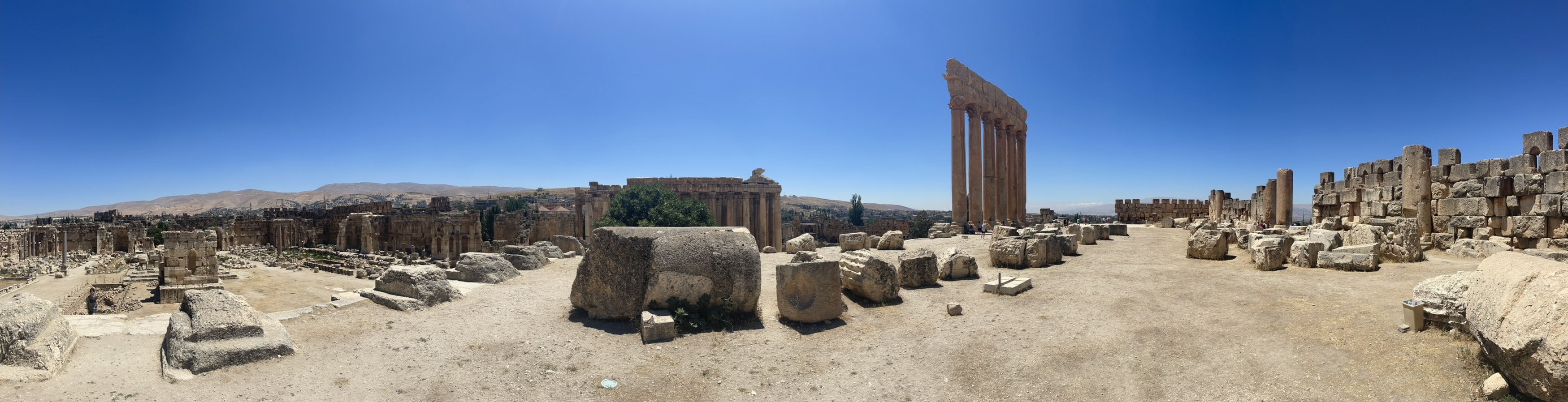
Baalbek-Panorama.jpeg. 110vw × 110vh, centered.
Extra 10% gives parallax room to move.
object-fit: cover; object-position: center 30%.
Filter dark:
saturate(0.82) brightness(0.76) contrast(1.06).
Filter light:
saturate(0.78) brightness(0.68) contrast(1.10).
Charbel-Suit-Cutout.png. Desktop:
right: clamp(8vw,14vw,18vw); bottom: -95%; height: 185%;
                    max-width: 55%
. The negative bottom pushes it down so the torso is visible;
the tall height ensures the cutout is appropriately large.
Shadow:
drop-shadow(-16px 0 48px rgba(30,20,5,0.5)) drop-shadow(0
                    24px 32px rgba(20,15,5,0.35))
.
padding: 0 clamp(2.5rem,6.5vw,5rem); max-width:
                    clamp(420px,56vw,720px); gap: 2rem; justify-content: center;
                    align-self: stretch
. Left-anchored glass-free content panel.
max-width: 100%; padding: 1.75rem 1.5rem 2.25rem; gap:
                    1rem
. Gets full glass treatment: var(--glass-bg),
backdrop-filter: blur(32px), top border, inner
highlight. Sits at the bottom of the screen (hero is
align-items: flex-end on mobile).
::before that fades from
var(--accent-bright) to transparent.
.hero-scroll-hint — exists in the HTML
(aria-hidden="true") but is
display: none in CSS. Contains a
.scroll-line div animated by
scrollDrop (2.4s infinite scaleY pulse) and a
vertical text label. Do not remove — it may be re-enabled. See
Section 06 animation inventory.
assets/js/parallax.js deferred. Analytics
deferred 2s after load.
.page.page--padded — 5rem top padding to clear
the fixed nav. Background is bare var(--bg) — no
hero image.
max-width: 860px; margin: 0 auto. Desktop:
2-column grid — name left (col 1), lead text right (col 2),
align-items: start; lead align-self: center. The
lead text vertically centers against the name's height.
Mobile: 1-column, lead drops below name.
linear-gradient(to right, var(--accent),
                    rgba(201,168,76,0.15), transparent)
. Fades out to the right.
max-width: 860px; margin: 0 auto.
.glass-card. Bio
has .glass-card--bio extra padding. Cards are in
a flex column with 1rem gap. Max-width 860px, centered.
.bio-text p:first-child::first-letter: Cormorant
Garamond 600, 3.2em, float left, color
var(--accent). A ::after clearfix
pseudo-element on the same paragraph prevents following
paragraphs from wrapping under the float.
Born in Beirut, raised in Boston since age three — I've
spent my whole life between two worlds, and I think that's
made me a better builder. The drop cap floats left and the
clearfix ::after on this paragraph prevents the
next one from wrapping beneath it.
This second paragraph starts cleanly on a new line — proof the clearfix is working. Without it, this text would wrap under the large floated initial letter.
.pill is
100px-radius, background: var(--pill-bg). Hover:
gold border + accent color + translateY(-2px) + subtle gold
shadow.
grid-template-columns: repeat(5, 1fr) always —
exactly 5 languages. Mobile (≤560px):
repeat(3, 1fr) for 3+2 layout. Each item has:
flag emoji 1.65rem, name, 3-dot proficiency row (filled dots =
var(--accent)), level label.
.reveal. Cards stagger: 0s, 0.12s, 0.24s.
Script: parallax.js deferred.
var(--accent). Underline via
border-bottom: 1px solid rgba(201,168,76,0.25)
— faint at rest, brightens to var(--accent) on
hover. Transition: 0.2s var(--ease).
.page:
min-height: 100vh; overflow-x: hidden — the root
shell for every page. .page--padded adds
padding-top: 5rem to clear the fixed nav on
non-hero pages (about, design-language).
.not-found is
height: 100vh; height: 100svh; max-height: 100vh;
                    max-height: 100svh; display: flex; flex-direction: column;
                    align-items: center; justify-content: center; overflow:
                    hidden
. Locked to exactly the viewport — no scroll. The marquee is
position: fixed; inset: 0 so it fills the screen
independently.
nfMarqueeLeft). Odd rows (1, 3) → scroll right
(nfMarqueeRight). Duration increases per row by
DURATION_VAR / ROWS = 1.6s per row. Start delay:
-rowIndex × 3.5s (negative = already in
progress).
<body> element:
class="no-scroll". CSS sets
overflow: hidden — locks the page to exactly the
viewport. Prevents any scroll on the 404 page.
<meta name="robots" content="noindex,
                    nofollow">
. No schema, no OG tags — 404 pages should never be
indexed.
.btn-primary
.btn-secondary
Paired — as used on the hero (.btn-group)
Hover to see shimmer sweep & lift
display: inline-flex; align-items: center; justify-content:
                    center
.
0.85rem 1.75rem. border-radius:
2px — intentionally almost square. Contrasts with
the rounded nav pill and cards. Sharpness = precision.
::before pseudo-element sweeps
left: -100% → 160%. A 60%-wide angled white
gradient at 105deg. Transition:
0.45s var(--ease-out). Creates a
light-across-surface effect.
transform: translateY(-3px) via
0.22s var(--ease-spring). Slight overshoot makes
it feel alive.
linear-gradient(135deg, var(--accent) 0%,
                    var(--accent-bright) 100%)
#0E0D0B — always charcoal, regardless of mode.
Gold bg requires dark text for contrast.
inset 0 1px 0 rgba(255,255,255,0.22), 0 4px 16px
                    rgba(201,168,76,0.22)
var(--accent-bright) → #E8C96A. Shadow expands to
0 10px 32px rgba(201,168,76,0.38).
background: rgba(242,239,232,0.06), color:
rgba(242,239,232,0.78), border:
rgba(242,239,232,0.18). Subtle glass look.
backdrop-filter: blur(8px).
background: rgba(26,21,16,0.05), color:
var(--fg), border:
rgba(26,21,16,0.18). Adapts to warm parchment
bg.
var(--accent), color →
var(--accent), bg →
var(--accent-dim),
translateY(-3px).
display: block on a .btn. They use
display: inline-flex for text centering. If you need a
block-level button, wrap it in a block container.
.skip-linkVisually hidden until focused via keyboard — satisfies WCAG 2.1 SC 2.4.1 (Bypass Blocks). Present on every page as the first focusable element. Tab to it on any page to see it snap into view.
position: absolute; top: -100% — off-screen
above the viewport. Invisible to sighted users.
top: 0 — snaps to the top-left corner.
outline: 2px solid #0e0d0b. Transition:
0.15s ease.
var(--accent-bright). color:
#0e0d0b (charcoal — always dark regardless of
mode for contrast). border-radius: 0 0 4px 4px —
flat top, rounded bottom, drops from the top edge.
9999 — above everything including the nav (z-index: 200).
aria-hidden="true" focusable="false". They
have no semantic content.
alt="" (empty alt,
not missing). They are presentational — screen readers skip
empty alt correctly.
role="navigation" aria-label="Main navigation"
on <nav>.
<a> has role="listitem",
aria-label, and the <i> inside
has aria-hidden="true". The list wrapper has
role="list".
@media (prefers-reduced-motion: reduce) block at
end of style.css. All animation properties nulled. Parallax.js
and 404.js both check matchMedia before initialising motion.
Never skip this for new animations.
#F2EFE8 on
#0E0D0B passes WCAG AA. Light mode hero: text is
over a dense parchment vignette (0.94 opacity) — effectively
parchment on parchment. Always test the hero in light mode
when changing vignette values.
outline: none without providing an alternative
focus indicator.
<link rel="preload" as="image"
                    fetchpriority="high">
in index.html <head>. Also have
loading="eager" fetchpriority="high" decoding="async"
on the img element.
<link rel="preload" href="assets/css/style.css"
                    as="style">
on all pages.
crossorigin on
index.html. Google Fonts loaded non-blocking (media="print" onload).
load event. Never in <head>,
never blocking. ID redacted from this document.
will-change: transform on .hero-bg,
.hero-fg, and .about-watermark. All
parallax transforms use translate3d (forces GPU
layer). Disabled by will-change: auto under
reduced-motion.
addEventListener scroll/mousemove calls use
{ passive: true }. Never call
preventDefault() in scroll handlers.
index, follow) — it is a legitimate SEO/GEO asset demonstrating design
system thinking. Logo links home from here.
#0E0D0B.
https://habchy.com/assets/images/Charbel-Suit.jpeg
— the suit photo, not the panorama. People need a face for
social previews.
Charbel-Suit.jpeg. Used in structured data
on index.html and about.html.
summary_large_image — ensures the image is shown
large in Twitter/X previews.
https://habchy.com/. about.html →
https://habchy.com/about.
noindex, nofollow. No OG tags. No schema. No
canonical.
:root and the
dark-mode override block.
@media (prefers-color-scheme) in CSS. Never add a
JS theme toggle — it's not in the design, it would add
complexity, and the CSS-only approach is more reliable.
outline: noneDon't suppress focus rings without providing an equivalent.
Keyboard users need to see focus states.
transform. Animate
the wrapper divs (.hero-bg-wrap, .hero-fg-wrap) for load-in.
See section 07.
backdrop-filter with
-webkit-backdrop-filter. Same for any other
vendor-prefix property.